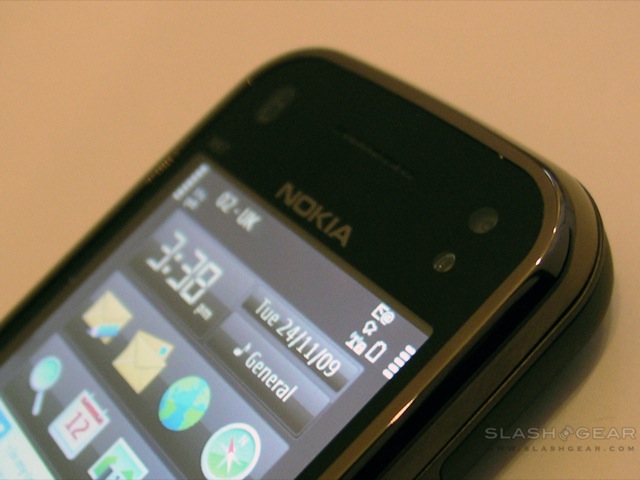
We’ve had two QWERTY Nokia smartphones on the SlashGear test-bench this past week, and the surprising thing is how differently the respective user experience is. Our Nokia E72 review went live earlier today; now we turn to the Nokia N97 mini, viewed by many – for better or for worse – as the Finnish company’s second attempt at the N97. Second-time lucky or still well short? Check out the full SlashGear review after the cut.

To understand the N97 mini, you have to put it into context with the original N97 it’s a “miniaturised” version of. The Nokia N97 practically epitomises the difficulty in balancing hype, consumer anticipation, cutting-edge hardware and delivery schedules: when it was first announced in December 2008 it promised a compelling package of the latest in smartphone technology, but by the time it hit reviewers’ hands in June 2009 it proved to fall well short of expectations.
Since then Nokia have pushed out a significant new firmware release that addressed many issues with the original smartphone, and of course they’ve also delivered the N97 mini, a more compact version of the N97 intended to address many of its shortcomings. We pulled no punches in our N97 review, so the N97 mini has plenty of work to do in order to impress us.
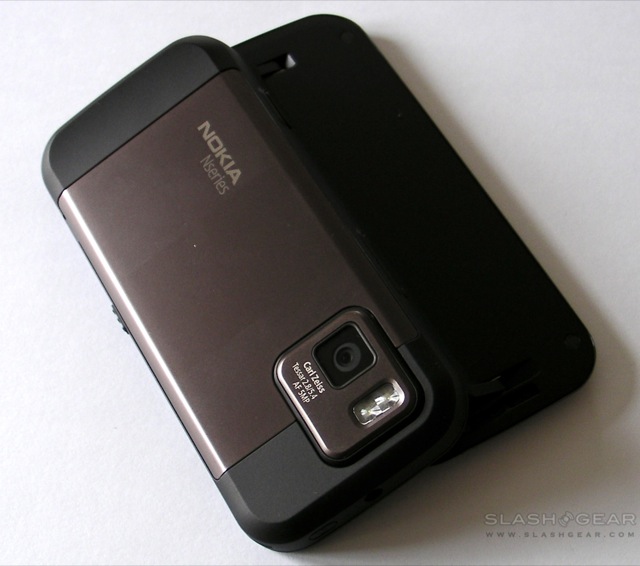
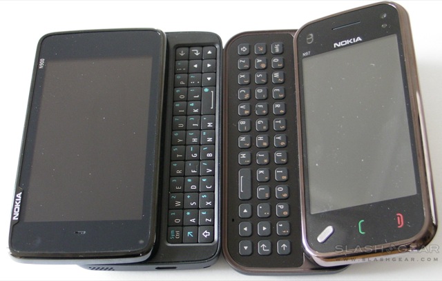
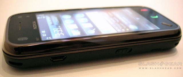
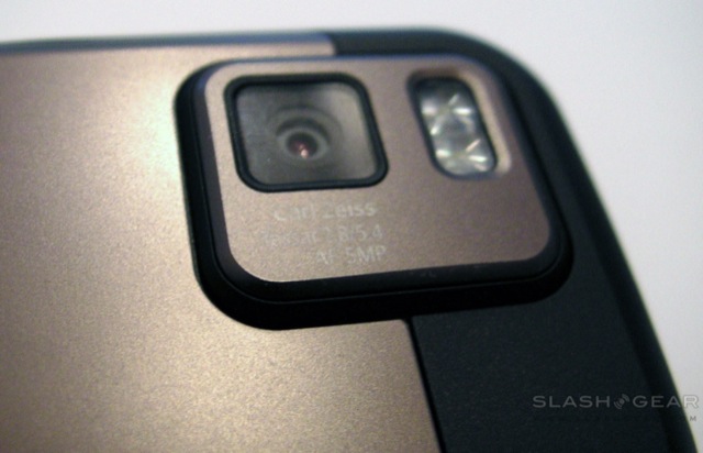
Physically, as you might imagine, it’s a smaller phone. The original N97 is 117.2 x 55.3 x 15.9 mm, tipping the scales at 150g, while the N97 mini is 113 x 52.5 x 14.2 mm and 138g. That means there’s less room for the display – which slips from 3.5- to 3.2-inches, though sticks at 640 x 360 resolution – but it also means it’s a far more pocket-friendly handset. Interestingly, there are minimal hardware concessions involved elsewhere: the N97 mini doesn’t have a sliding lens cover, but it does keep the 5-megapixel autofocus camera with Carl Zeiss optics and dual-LED flash, together with a front-facing camera for video calling. The GPS and A-GPS are still present, together with ambient light, orientation and proximity sensors, and connectivity doesn’t fall short either: the N97 mini is packed with quadband WCMDA 850/900/1900/2100 as well as Bluetooth 2.0+EDR, WiFi b/g, a microUSB 2.0 connection and a 3.5mm headphones socket.
Nokia N97 mini unboxing video:
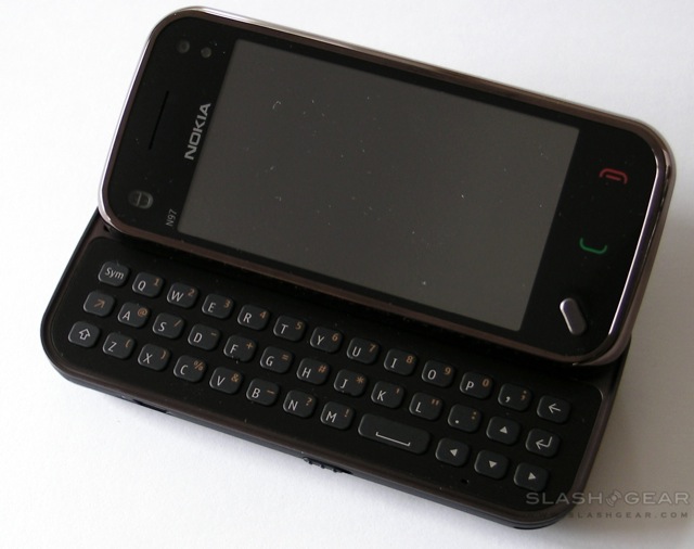
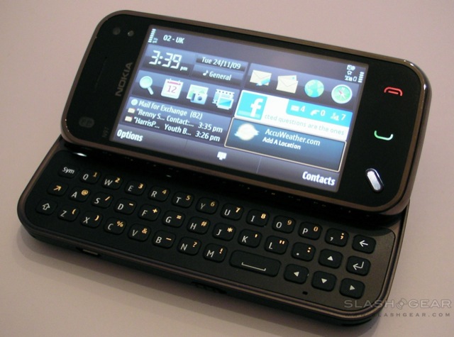
Unfortunately you’re still stuck with the one-position screen angle, which is results in plenty of hand-tilting as you try to thumb-type and see the display at the best angle. The touchscreen itself uses a resistive panel rather than the currently fashionable capacitive, but is reasonably responsive and accurate nonetheless. OS is S60 5th edition, Nokia’s attempt to bring finger-friendliness to Symbian, and it remains a mixed bag. The recent firmware 2.0 update for the N97 also applies to the N97 mini, and addresses many of our original complaints, particularly in terms of the visual appeal and the introduction of “kinetic scrolling”.

It’s still not as attractive as, say, Palm’s webOS or the iPhone, and many of the menus still seem to merely be bigger – i.e. finger-sized – than they were before. Lists continue to respond differently to taps depending on whereabouts in the OS you are: settings, for instance, usually respond to a single tap, whereas lists of items (such as email messages) take one tap to select and another to open. We can partly see the logic in this, but when other platforms use the more intuitive press-and-hold to deliver the same, Nokia’s system begins to look unnecessarily fiddly.
The display aspect is less than ideal too, particularly when you’re dealing with emails. We can’t find any way to show the email list with sender and subject split across two lines, and as such you get both a sharply truncated name and very little of the subject line. It’s difficult to triage your inbox without actually going into the message itself, which adds a few unwanted steps to the process. On the plus side, the N97 mini does have extensive email account support, including the basic POP and IMAP together with Mail for Exchange, and where the E72 dropped the ball in dealing with our Exchange-like Kerio Mail Server, the mini handled it with no problems whatsoever. We did experience a couple of odd connection issues, however, where the smartphone would “forget” by which method it was meant to pull in new emails; we wish Nokia would make things a little more straightforward, using whatever the active connection is (whether WiFi or 3G) without the user needing to be so prescriptive.
Like the E72, the N97 mini’s browser supports full HTML with in-page Flash video, which means no separate app is required to play back YouTube content (among others). Of course there’s still no multitouch zooming, and instead the N97 mini uses double-tap to zoom; unfortunately webpage text doesn’t reflow accordingly, and despite the accelerometer the screen orientation doesn’t flip even if you turn the phone on its side, you have to push out the keyboard in order to get a landscape view. Still, pages render pretty much as you’d expect from a desktop browser.
Firmware 2.0 also brought with it the latest version of Nokia Maps, and as with the E72 it’s been a pleasing experience seeing what the rivals of Google Maps have come up with. The N97 mini includes a digital compass and locks onto a GPS signal quickly, while the app itself does a better job than its rival in presenting that data on-screen. Various map-types are provided, including a traffic overlay, and it’s just as easy to pull up walking directions as it is driving (though once the trial licence of pedestrian directions runs out, you’ll need to pay for the functionality). There are still no spoken guidance prompts, however, unlike the Google Maps Navigation beta for Android in the US.
Nokia have won many admirers over the past year or two with the quality of their cameras, and the N97 mini’s 5-megapixel autofocus shooter is reasonable. Our general dislike of LED flashes – which we find have a very narrow “sweet spot” outside of which they either over-saturate the subject or prove hopelessly lacking in power – is tempered by decent low-light performance with the flash switched off. Give the N97 mini an outdoor shot however and you’ll find acceptable results; we were also particularly impressed by the macro close-ups, with the phone automatically switching into the necessary mode to keep nearby subjects in crisp focus. The onboard 8GB of memory is less than the original N97’s 32GB, but slot in a microSD card and you’ll have up to 24GB to play with. You can find sample shots in the gallery below.

The camera will also shoot 30fps 16:9 aspect video in MPEG4 640 x 360 resolution, which turned out to be smooth and reasonably watchable. You can switch on the LED flash to act as a video light, though autofocus no longer works. Once you’ve shot a clip you can upload it to various media sharing sites, including Flickr and Nokia’s own Ovi gallery.
As for consuming media rather than producing it, the N97 mini has the same audio app as on the E72 only with larger, finger-accomodating icons. The interface is lacking in comparison to something like the iPhone, but it’s serviceable and there’s a link directly to Nokia’s Music Store (though not Comes With Music, which the company don’t offer on this handset) for on-device downloads. As with the N97 there’s an FM radio (which requires a wired headset be plugged in) but no FM transmitter; Nokia say the short-range transmitter – handy for in-car use – couldn’t be squeezed into the N97 mini’s reduced casing. Video playback is in a separate app, and consists of a simple folder-browsing UI for local content together with a Video Feeds browser which allows you to access streaming content.
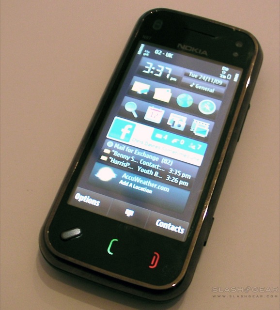
Access to all of these apps is usually through the main menu, called up no matter where you are in the phone by pressing the single hardware button on the fascia. However, like its sibling, the N97 mini’s homescreen is made up of six rectangular widget panels which can be rearranged and edited. Among the options are standard shortcut bars – each offering room for four icons linking to your commonly-accessed apps – as well as frequent contact shortcuts, an AccuWeather forecast widget, Mail for Exchange widget and a clock with links to the alarm settings and calendar. There’s also a Facebook widget which ties into Nokia’s somewhat sluggish Facebook app. This shows galleries, wall posts and offers one-tap access to the camera and on-device gallery so as to make uploading shots easier, but is tardy in its responsiveness – especially when updating the Facebook wall – compared to similar apps on rival platforms.
Phone performance was strong, with the N97 mini tenacious with a signal. We experienced no dropped calls in all of our testing, and both parties reported clear and crackle-free audio. Battery life has proven slightly better than what you’d expect from a current-gen smartphone, capable of going two days with regular use (and judicious use of the peak/off-peak push email settings). Nokia quote up to 430 minutes of GSM talktime (240 minutes of WCDMA) or up to 320 hours of GSM standby (310 hours of WCDMA).

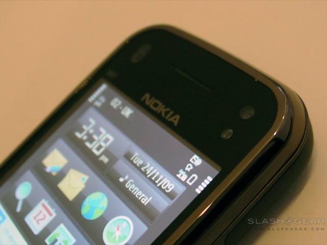
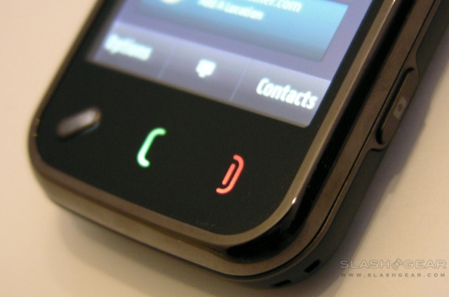
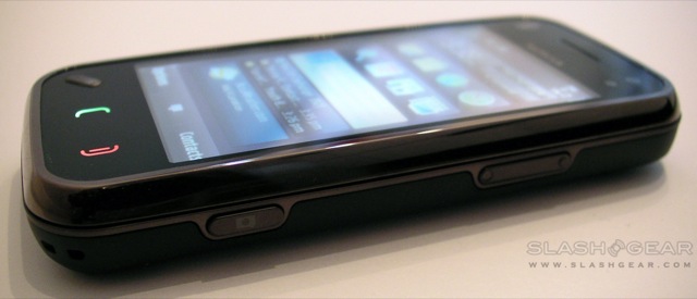
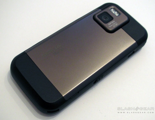
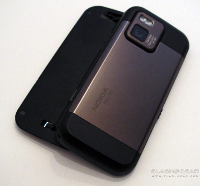
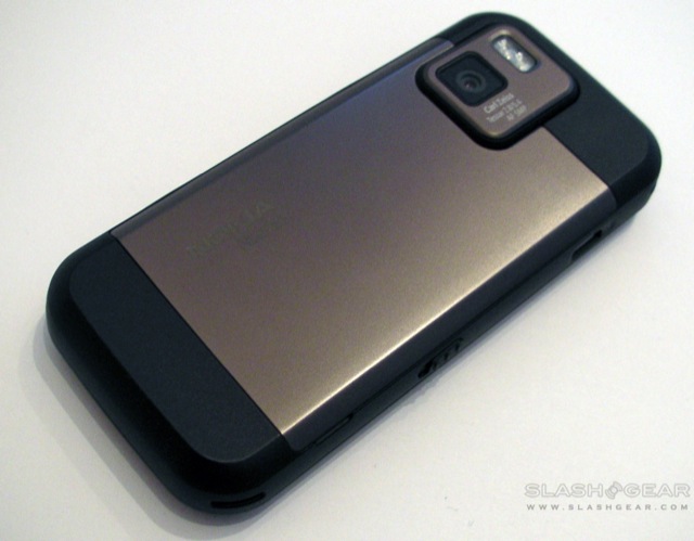
Build quality is better than the N97, with a sturdy case and touches of metal in the screen fascia and battery cover; we’re also quiet fans of the “cherry black” finish (though you can also get the N97 mini in “garnet”). Less impressive is the flex in the plastic screen surround up above the earpiece, though to be fair that’s our only real point of concern about the N97 mini’s construction.
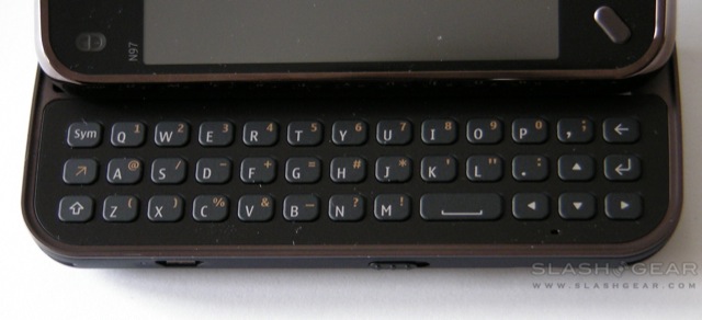
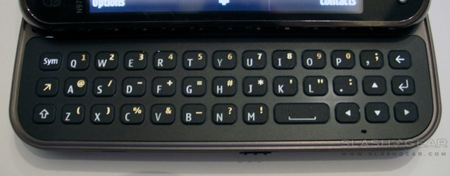
Overall, then, we feel a whole lot warmer toward the Nokia N97 mini than we did toward the original N97. Its slimmed-down design and improved software have taken much of the sting out of ownership, and the compromises – the absence of an FM transmitter and the smaller onboard storage – are minor in comparison to the far better keyboard and sturdier build. Still, none of what it offers is quite a home-run in the smartphone game right now; the OS is improved but still feels drab and mildly clunky in comparison to rival platforms, and the QWERTY ‘board is a long way off the best we’ve played with in recent months.
Bizarrely, if they’ve beaten anything, Nokia have killed off enthusiasm for the N97; the two handsets will go on sale alongside each other, and the UK store even has the N97 mini at £429 and the original at £449. Having lived with the N97 mini we’re not sure why anybody would plump for the original, frankly. As for the mini itself, we must admit to being more enthusiastic about the Maemo OS and its potential than we are about this current device. Nokia obviously have some good ideas left in them, but the N97 mini feels like what the original N97 should have been, rather than a new product in its own right.
To understand the N97 mini, you have to put it into context with the original N97 it’s a “miniaturised” version of. The Nokia N97 practically epitomises the difficulty in balancing hype, consumer anticipation, cutting-edge hardware and delivery schedules: when it was first announced in December 2008 it promised a compelling package of the latest in smartphone technology, but by the time it hit reviewers’ hands in June 2009 it proved to fall well short of expectations.
Since then Nokia have pushed out a significant new firmware release that addressed many issues with the original smartphone, and of course they’ve also delivered the N97 mini, a more compact version of the N97 intended to address many of its shortcomings. We pulled no punches in our N97 review, so the N97 mini has plenty of work to do in order to impress us.
Physically, as you might imagine, it’s a smaller phone. The original N97 is 117.2 x 55.3 x 15.9 mm, tipping the scales at 150g, while the N97 mini is 113 x 52.5 x 14.2 mm and 138g. That means there’s less room for the display – which slips from 3.5- to 3.2-inches, though sticks at 640 x 360 resolution – but it also means it’s a far more pocket-friendly handset. Interestingly, there are minimal hardware concessions involved elsewhere: the N97 mini doesn’t have a sliding lens cover, but it does keep the 5-megapixel autofocus camera with Carl Zeiss optics and dual-LED flash, together with a front-facing camera for video calling. The GPS and A-GPS are still present, together with ambient light, orientation and proximity sensors, and connectivity doesn’t fall short either: the N97 mini is packed with quadband WCMDA 850/900/1900/2100 as well as Bluetooth 2.0+EDR, WiFi b/g, a microUSB 2.0 connection and a 3.5mm headphones socket.
Nokia N97 mini unboxing video:
Unfortunately you’re still stuck with the one-position screen angle, which is results in plenty of hand-tilting as you try to thumb-type and see the display at the best angle. The touchscreen itself uses a resistive panel rather than the currently fashionable capacitive, but is reasonably responsive and accurate nonetheless. OS is S60 5th edition, Nokia’s attempt to bring finger-friendliness to Symbian, and it remains a mixed bag. The recent firmware 2.0 update for the N97 also applies to the N97 mini, and addresses many of our original complaints, particularly in terms of the visual appeal and the introduction of “kinetic scrolling”.
It’s still not as attractive as, say, Palm’s webOS or the iPhone, and many of the menus still seem to merely be bigger – i.e. finger-sized – than they were before. Lists continue to respond differently to taps depending on whereabouts in the OS you are: settings, for instance, usually respond to a single tap, whereas lists of items (such as email messages) take one tap to select and another to open. We can partly see the logic in this, but when other platforms use the more intuitive press-and-hold to deliver the same, Nokia’s system begins to look unnecessarily fiddly.
The display aspect is less than ideal too, particularly when you’re dealing with emails. We can’t find any way to show the email list with sender and subject split across two lines, and as such you get both a sharply truncated name and very little of the subject line. It’s difficult to triage your inbox without actually going into the message itself, which adds a few unwanted steps to the process. On the plus side, the N97 mini does have extensive email account support, including the basic POP and IMAP together with Mail for Exchange, and where the E72 dropped the ball in dealing with our Exchange-like Kerio Mail Server, the mini handled it with no problems whatsoever. We did experience a couple of odd connection issues, however, where the smartphone would “forget” by which method it was meant to pull in new emails; we wish Nokia would make things a little more straightforward, using whatever the active connection is (whether WiFi or 3G) without the user needing to be so prescriptive.
Like the E72, the N97 mini’s browser supports full HTML with in-page Flash video, which means no separate app is required to play back YouTube content (among others). Of course there’s still no multitouch zooming, and instead the N97 mini uses double-tap to zoom; unfortunately webpage text doesn’t reflow accordingly, and despite the accelerometer the screen orientation doesn’t flip even if you turn the phone on its side, you have to push out the keyboard in order to get a landscape view. Still, pages render pretty much as you’d expect from a desktop browser.
Firmware 2.0 also brought with it the latest version of Nokia Maps, and as with the E72 it’s been a pleasing experience seeing what the rivals of Google Maps have come up with. The N97 mini includes a digital compass and locks onto a GPS signal quickly, while the app itself does a better job than its rival in presenting that data on-screen. Various map-types are provided, including a traffic overlay, and it’s just as easy to pull up walking directions as it is driving (though once the trial licence of pedestrian directions runs out, you’ll need to pay for the functionality). There are still no spoken guidance prompts, however, unlike the Google Maps Navigation beta for Android in the US.
Nokia have won many admirers over the past year or two with the quality of their cameras, and the N97 mini’s 5-megapixel autofocus shooter is reasonable. Our general dislike of LED flashes – which we find have a very narrow “sweet spot” outside of which they either over-saturate the subject or prove hopelessly lacking in power – is tempered by decent low-light performance with the flash switched off. Give the N97 mini an outdoor shot however and you’ll find acceptable results; we were also particularly impressed by the macro close-ups, with the phone automatically switching into the necessary mode to keep nearby subjects in crisp focus. The onboard 8GB of memory is less than the original N97’s 32GB, but slot in a microSD card and you’ll have up to 24GB to play with. You can find sample shots in the gallery below.
The camera will also shoot 30fps 16:9 aspect video in MPEG4 640 x 360 resolution, which turned out to be smooth and reasonably watchable. You can switch on the LED flash to act as a video light, though autofocus no longer works. Once you’ve shot a clip you can upload it to various media sharing sites, including Flickr and Nokia’s own Ovi gallery.
As for consuming media rather than producing it, the N97 mini has the same audio app as on the E72 only with larger, finger-accomodating icons. The interface is lacking in comparison to something like the iPhone, but it’s serviceable and there’s a link directly to Nokia’s Music Store (though not Comes With Music, which the company don’t offer on this handset) for on-device downloads. As with the N97 there’s an FM radio (which requires a wired headset be plugged in) but no FM transmitter; Nokia say the short-range transmitter – handy for in-car use – couldn’t be squeezed into the N97 mini’s reduced casing. Video playback is in a separate app, and consists of a simple folder-browsing UI for local content together with a Video Feeds browser which allows you to access streaming content.
Access to all of these apps is usually through the main menu, called up no matter where you are in the phone by pressing the single hardware button on the fascia. However, like its sibling, the N97 mini’s homescreen is made up of six rectangular widget panels which can be rearranged and edited. Among the options are standard shortcut bars – each offering room for four icons linking to your commonly-accessed apps – as well as frequent contact shortcuts, an AccuWeather forecast widget, Mail for Exchange widget and a clock with links to the alarm settings and calendar. There’s also a Facebook widget which ties into Nokia’s somewhat sluggish Facebook app. This shows galleries, wall posts and offers one-tap access to the camera and on-device gallery so as to make uploading shots easier, but is tardy in its responsiveness – especially when updating the Facebook wall – compared to similar apps on rival platforms.
Phone performance was strong, with the N97 mini tenacious with a signal. We experienced no dropped calls in all of our testing, and both parties reported clear and crackle-free audio. Battery life has proven slightly better than what you’d expect from a current-gen smartphone, capable of going two days with regular use (and judicious use of the peak/off-peak push email settings). Nokia quote up to 430 minutes of GSM talktime (240 minutes of WCDMA) or up to 320 hours of GSM standby (310 hours of WCDMA).
Build quality is better than the N97, with a sturdy case and touches of metal in the screen fascia and battery cover; we’re also quiet fans of the “cherry black” finish (though you can also get the N97 mini in “garnet”). Less impressive is the flex in the plastic screen surround up above the earpiece, though to be fair that’s our only real point of concern about the N97 mini’s construction.
Overall, then, we feel a whole lot warmer toward the Nokia N97 mini than we did toward the original N97. Its slimmed-down design and improved software have taken much of the sting out of ownership, and the compromises – the absence of an FM transmitter and the smaller onboard storage – are minor in comparison to the far better keyboard and sturdier build. Still, none of what it offers is quite a home-run in the smartphone game right now; the OS is improved but still feels drab and mildly clunky in comparison to rival platforms, and the QWERTY ‘board is a long way off the best we’ve played with in recent months.
Bizarrely, if they’ve beaten anything, Nokia have killed off enthusiasm for the N97; the two handsets will go on sale alongside each other, and the UK store even has the N97 mini at £429 and the original at £449. Having lived with the N97 mini we’re not sure why anybody would plump for the original, frankly. As for the mini itself, we must admit to being more enthusiastic about the Maemo OS and its potential than we are about this current device. Nokia obviously have some good ideas left in them, but the N97 mini feels like what the original N97 should have been, rather than a new product in its own right.

As that creepy guy said at the beginning of The Twilight Zone: there's a fifth dimension beyond that which is known to humanity. We like to call it 'The BlackBerry Zone'. In this parallel world ofmobile phones, everything works slightly differently -- all screens are landscape displays, for example. RIM's BlackBerry Curve 8520 provides an inexpensive entry into this alternate phone reality, and we think you might just like it. You'll be burning up the social networks thanks to its Qwerty keyboard and solid apps, and a decent collection of media options means it's fun time, baby.
You can grab the 8520 from free on a £25-per-month contract. It's also available for about £240 SIM-free.
Cheap and cheerful
The BlackBerry family is rowing a lonely boat from the island of suit-wearing business types to the sweet shores of everyday consumers, and it's making good headway. The 8520 should give its kin a boost, thanks to an entry-level price and a solid range of fun features that will tempt even the most diehard suit-hater.
The BlackBerry family is rowing a lonely boat from the island of suit-wearing business types to the sweet shores of everyday consumers, and it's making good headway. The 8520 should give its kin a boost, thanks to an entry-level price and a solid range of fun features that will tempt even the most diehard suit-hater.
The 8520 feels like a stripped-down version of the BlackBerry Curve 8900, forgoing the jazzy chrome trim for a rubbery edge. You can feel it's a less expensive phone, but it still feels solid and sturdy, and the rubber edge should help those with sweaty fingers hang on to the device.

We're grateful for the 8520's 3.5mm headphone jack, but it's placement on the side of the phone is rather awkward
To highlight the 8520's fun-loving attitude, the phone comes in a few different colours. We had the purple version. We recommend that -- unless you're a teenager or trying to thwart thieves -- you get the black version. We really can't stress this enough. The black version looks quite appealing. The purple model looks like baby puke.
Touch my trackpad
The biggest difference between the 8520 and other devices on the BlackBerry bush is its trackpad, which replaces the trackball you may know and love. The trackpad is a flat surface that responds to your touch like a mousepad on a laptop, but it's insanely sensitivity to make up for its tiny size.
The biggest difference between the 8520 and other devices on the BlackBerry bush is its trackpad, which replaces the trackball you may know and love. The trackpad is a flat surface that responds to your touch like a mousepad on a laptop, but it's insanely sensitivity to make up for its tiny size.
The trackpad isn't quite as accurate as the trackball, but it's very good, and it makes the phone easier to pop into a pocket, since it doesn't stick out from the body and get gunged up with dirt and crud. It's no wonder that RIM says the trackpad will be a feature on most new BlackBerry models, and we're happy to see this innovation making its debut on a cheaper phone.
Rocking the Qwerty
The 8520's real strength lies in its Qwerty keyboard and messaging features, which make it a great phone for social networkers. You can set up as many as ten email accounts, and, because the phone supports 'push' email, you'll get messages as they arrive, rather than waiting for your inbox to update itself.
The 8520's real strength lies in its Qwerty keyboard and messaging features, which make it a great phone for social networkers. You can set up as many as ten email accounts, and, because the phone supports 'push' email, you'll get messages as they arrive, rather than waiting for your inbox to update itself.
We like the solidly built applications for sites like Twitter and Facebook, as well as the instant-messaging app. They combine with a full Qwerty keyboard to make a social butterfly's fantasy phone, since long messages can be easily and accurately typed. Dialling isn't as straightforward as on other phones, however, since the number keys are mixed in with the letters. On our purple model, they were hard to read.
The lack of 3G support put the brakes on our surfing while we were out and about, but it's still possible -- especially for data-light tasks like sending tweets. Happily, the phone does have Wi-Fi connectivity, which speeds things up when you're on a wireless network. Straight-up surfing the Web in the browser is okay. It's better than on a typical phone with a small screen and no trackpad, but worse than on a Webmeister like the iPhone. Web pages look clear and accurate, but we hated having to zoom in to click on smaller links. For some pages, that added a couple of clicks where none were necessary.
There's also no GPS, although you can use Google Maps, which triangulates your position using mobile-phone towers. It's not as accurate as GPS, though.
User-interface niggles
Most phones rock quite similar user interfaces, but the BlackBerry evolved along its own branch of the phone family tree, so it can take some getting used to if you're new to it. We found the 8520's UI generally easy to navigate, although we have a few niggling complaints. For example, the default menu icons are hard to make out, and there will be too many options for some people to handle.
Most phones rock quite similar user interfaces, but the BlackBerry evolved along its own branch of the phone family tree, so it can take some getting used to if you're new to it. We found the 8520's UI generally easy to navigate, although we have a few niggling complaints. For example, the default menu icons are hard to make out, and there will be too many options for some people to handle.
The BlackBerry UI is also starting to feel rather dated compared to the jazzy UIs flaunted by bad asses like the HTC Hero. The address book, for example, is a boring list of names unembellished by any styling or added functionality. There are fun features in there -- open a contact and you can see their Facebook profile picture, for example -- but the list is as vanilla as a party at Cliff Richard's house. Happily, you can download apps that jazz up your contact list, home screen and other areas.
BlackBerry App World is also on-board, so finding and installing apps is as easy as baking a moderately easy-to-bake pie. There are plenty of great apps available, although they're pricier than in competitors' app stores, with a minimum price of about $3 (£1.80). What the heck are we quoting US dollar prices for? Good question. App World displays prices in dollars until you've logged into your UK PayPal account for the first time, and the prices in sterling are based on the US prices, so they'll fluctuate with the exchange rate. That, dear friends, is pants.
Media mogul
The screens on recent BlackBerry phones have been stunning, and the 8520's didn't disappoint either, despite having a lower resolution than the 8900's -- 320x240 pixels, compared to 480x360. Videos are very watchable and photos look good, although you won't get spectacular snaps out of the 8520's 2-megapixel camera. There's no flash, but the camera does shoot video.
The screens on recent BlackBerry phones have been stunning, and the 8520's didn't disappoint either, despite having a lower resolution than the 8900's -- 320x240 pixels, compared to 480x360. Videos are very watchable and photos look good, although you won't get spectacular snaps out of the 8520's 2-megapixel camera. There's no flash, but the camera does shoot video.
Listening to music on the 8520 is a painless experience. There are three dedicated music keys on the top to control the good times. We like that the music plays on while you're doing other things, but we'd like to see some information on the home screen about what's playing. In fact, the home screen as a whole seems like a waste of real estate, since the default setting only includes six shortcuts along the bottom of the screen.
Although we appreciate the 8520's standard 3.5mm headphone jack, it's placement on the side of the phone is awkward. When we had a pair of headphones plugged in, the connector jutted out to the side, making the phone difficult to slide into a pocket or bag.
A 2GB microSD card and 256MB of on-board memory provide a great start for slapping a good number of tunes and photos onto the phone.
Conclusion
RIM's BlackBerry Curve 8520 is a solid, reasonably priced introduction into the world of the CrackBerry, and should give more people a chance to find out what the addiction is all about. Good social-networking and messaging apps, combined with a Qwerty keyboard, make the 8520 a worthy option for social butterflies, although they may miss having 3G connectivity on-board.
360 View (Use slider below image)

Even before going to IFA I already had great expectations for LG Viewty KU990 . First, it’s the looks and the fact that it’s a successor for LG KE850 Prada full touchscreen phone.
Then it’s the specs:
- 3.6 Mbps HSDPA connectivity
- 3″ 400×240 px touchscreen
- 100MB of internal memory
- microSD memory card slot extendable up to 2GB
- dimensions 103.5×54.4×14.8 mm
- Weight: 112 g
With a specs like these, how can LG KU990 go bad? And it didn’t.
LG KU990 Viewty review. Camera
Here’s the picture made by LG Viewty in manual focus mode:
Another cool thing about taking pictures with LG Viewty is the speed with which they are saved. On your usual cameraphone it can take from 5 to 10 seconds between the moment you hear the click of picture being taken and when it appears on screen. LG Viewty does that in less then 2 seconds.
And that circle that you see around the camera lens? It’s actually a jog dial, that you can use to (digitally) zoom in and out in a camera mode or focus the camera in manual focus mode. And it doubles as a volume control when you are talking on the phone, or a scroll wheel to scroll through music tracks and menu options.

Here’re the effects that you get with video recorded at 120 fps on LG Viewty and played back at 15 fps:
It’s been made under pretty lousy lighting conditions, but you should get the general idea how slow motion effects can look on LG Viewty, even in a low light.
And if you want to know more about camera capabilities of LG KU990 Viewty phone, the guys from InToMobile.com has pointed me to this great video made by the girls from ShinyShiny.TV:
LG Viewty KU990 review. Multimedia&Navigation
For your media, in addition to all traditional formats like Mp3, AAC, 3GP and others, LG KU990 Viewty has the media player that supports MPEG4/Divx video file playback, so you’ll be able to watch downloaded clips, TV shows and movies on your phone.Between the touch controls and the Jog Dial, the overall navigation and interface of LG Viewty is very intuitive . I was easily browsing through the media files collection and menu options within minutes.
LG KU990 Viewty review. Text entry&dialing
Dialing numbers with the onscreen numeric keypad is no harder then on a normal phone. Writing SMS or e-mail with with onscreen QWERTY keyboard is even better.The best thing about the number and text entry on LG Viety KU990 is the tactile feedback. You can feel vibration every time you press a key on Viewty, making the process as intuitive as on any normal phone. Thank’s to incorporation of Immersion’s VibeTonz technology, LG was able to solve the problem of tactile feedback, that plagued early touchscreen devices, pretty well.

LG Viewty KU990 review. Other
LG Viewty KU990 model displayed at IFA was still a prototype, so there were some things missing to it.E.g. it was really awkward to try handwriting or draw pictures with a finger on a touchscreen. And there was no stylus available. But LG manager told me that stylus will be added in LG Viewty sales package. Unfortunately there’s no place for it in the body of the phone, so carrying it around might pose some problems
LG KU990 Viewty and other LG phones on display at IFA were not connected to GSM network, so I was unable to test phone/data functions for now. Among the features that Viewty will support, but were not available for testing are:
- Full HTML browsing via Obigo browser
- Tight mobile Google apps integration. Following Google applications will be preinstalled/integrated in LG Viewty:
- Google Maps
- Google Search
- Gmail Mobile
- Blogger Mobile
- YouTube, with a single click video uploads
LG Viewty KU990 review. Conclusions
LG KU900 Viewty is a great mobile phone with outstanding camera capabilities, easy navigation and operation and lot’s of other cool features, like on screen editing and drawing, MPEG4/Avi file playback, tactile feedback, tight mobile Google apps/YouTube integration and high speed data transfers.It may not have Multi-Touch features or the sleekness of the iPhone, but touch interface combined with JogDial on LG Viewty KU990 is still is very easy to use. And what it lacks in fancy gimmicks, LG Viewty certainly makes up in features and overall functionality.
There is one drawback to Viewty phone as well. LG Viewty KU990 is not a smartphone. It is a very good phone with good collection of additional applications, fast Internet browsing and the best camera features I’ve seen. It will also be able to run mobile JAVA apps. But if you are looking for rich third party software ecosystem like Symbian or Windows Mobile phones have, LG KU990 Viewty is not for you.
On the other hand, how many of us do really need a smartphone in their pocket? I got my wife Nokia E65 a few months back. She likes the form factor, but really hates the complexity around it. According to her, there’s too many options, too many choices and very often it’s just too hard to find the one simple thing she needs at the moment.
I usually end up fixing the things that got somehow messed up, every couple of weeks. Oh, and she never asked me to install a single third party software app.
According to LG, KU990 Viewty is due to be out by mid October in Europe. So I think I know already, what I’ll be getting my wife for Christmas.
Overall LG Viewty KU990 is one of the best phones I have tried and certainly the best one among the phones displayed during IFA Consumer Electronics show.

It may be one of the simplest phones you´ll see released this year, but there´s a very good reason for that: the price! You simply won´t be able to find a cheaper handset or better deal for a phone with a full QWERTY keyboard. So if you´re a keen emailer, constant texter, or avid status updater, then your busy little thumbs might be made very happy indeed by this thing.
Features
It´s fair to say that this phone is as interesting for what it doesn´t feature than what it does. There´s no 3G or WiFi, meaning that the standard EDGE / GPRS is the only way to hook up to the internet. There´s no GPS, so no working out your location or using any kind of navigational software. And there´s nothing like the accelerometers or other such fancy things found in other recently released phones. But this is all part of a very deliberate ploy by LG to release an absolute bargain basement phone that does just what you want of it, and no more.
The main focus of the phone then is that keyboard, and everything that you can do with it. With several apps and widgets pre-installed on the phone, you´ll find access to sites such as Facebook and Twitter almost instantaneous, meaning you can send messages or update your status almost immediately. Obviously this isn´t access to the full, graphics and photo-heavy version of Facebook, but if you just want to let the world know what´s going on in text form then that´s exactly what you can do here. And the phone also has all the usual software for SMS and emails, two things that if you use regularly you´ll find doing so with the physical keyboard an absolute pleasure.
The other good thing about how streamlined this phone is inside is how that means it´s also extremely streamlined on the outside too. It´s as thin and stylish as even the newest smartphones because it simply doesn´t have to pack in a bunch of chips and gadgets. The black/blue design is also very tasteful and you wouldn´t know to look at it at all just how cheap this phone is.
| Specifications: | |
| Display |
|
| Operating System | |
| Processor | |
| Memory |
|
| Network |
|
| Camera | 2 MP, 1600x1200 pixels |
| Video | Yes |
| Sound |
|
| Dimensions | 115.5 x 61 x 12.8 mm |
| Weight | 95 g |
| Battery |
|
| Features |
|
| Radio | |
| GPS | |
| Data | |
| GPRS | Class 12 (4+1/3+2/2+3/1+4 slots), 32 - 48 kbps |
| HSCSD | Yes |
| EDGE | Class 12 |
| 3G | |
| Wireless | |
| Bluetooth | v2.1 with A2DP |
| USB | v2.0 microUSB |
Conclusion
You´ll pretty much know straight away if you think this phone is something you want in your life. Just have a look at your thumb tips... if they´re red raw that means you´re someone who texts, emails and uses other typing functions all the time. So do your thumbs a favour, have a look at investing in the LG GW300!
360 View (Use slider below image)
360 View (Use slider below image)

Nokia is also (finally) taking form factor much more seriously: at 10mm thick, the E71 is one of the slimmest Nokia phones to date, and Nokia claims it's the thinnest QWERTY smartphone on the market. The E71 also attacks the drab, plastic looks of its predecessors with chrome accents and a glossy screen. The phone is incredibly pocketable, and comfortable to hold and use. Of course, with the smaller size Nokia had to cut down on screen real estate and keyboard spacing, but at a QVGA resolution there's little suffering on that front. The keyboard had a much more rigid, clicky feel to it compared to the spongy keys of the E62, and we were virtually typo-free on it within minutes.


With all this concentration on the exterior, Nokia hasn't forgotten the feature overload of old. The E71 includes A-GPS, WiFi, a 3.2 megapixel camera, A2DP Bluetooth, 110MB of built-in memory and a microSD slot. There's also plenty of software to take advantage of all that tech, thanks to the quite-mature S60 platform. It's running 3rd Edition Feature Pack 1, which lacks the screen transition fanciness of FP2, but seems much more stable and usable to us than its fresh-faced successor. Being a business centric device, the E71 comes with a full complement of office, email and PIM software, including a feature to switch on the fully between business and personal accounts, complete with separate mailboxes and home screens.
We'll confess to being spoiled by the iPhone's touch interface -- while there is more customizability and more power at your fingertips with the standard, d-pad controlled S60, there certainly seem to be an abundance of button presses to accomplish even simple tasks, though we never feel lost or confused by the OS. Some of the truly powerful features include Nokia's impressive Maps 2.0 application, the WebKit-powered S60 browser (which even includes an easy-to-use feed reader), and a strong integration with online photo services such as Ovi and Flickr, the former of which even includes geotagging for your photos. Nokia's own music store doesn't yet support the United States, but while the media-playback interface pales in comparison to today's more music-centric phones, playback support is certainly there, including true YouTube and Flash support.

The screen isn't particularly stunning, only 2.36-inches diagonal, QVGA and none-too-bright, but it certainly gets the job done and leaves room for all that QWERTY. Battery life is basically a non-issue, with 20 days of standby, and 10.5 hours of GSM talk, though the 4.5 hours of 3G talk might pose an issue. We didn't really put the processor to the test, but load times for just about everything were quite zippy, especially compared to the E62's consistent sluggishness in loading up simple things like recent calls and the address book.
Overall it's all about your OS of choice and what exactly you want to do with your phone. If music and video playback are key, the E71's screen and interface are going to pose a challenge, and if typing is paramount you might need a slightly larger QWERTY keyboard -- though our typing speed after about a day was roughly equivalent to our iPhone speed after about a year of use. As for accomplishing what it sets out to do, the E71 manages it all with style, providing a plethora of features in a speedy, beautiful and miniscule device. Since Nokia won't be working with American carriers right away on subsidizing the E71 -- thouch we can keep hoping for an AT&T berth -- you'll have to spring about $500 to bring one home, but it might just be worth it!
360 View (Use slider below image)

Apple at its “Lets Rock” event held in San Francisco on September saw the curtain being raised for a new lineup of iPods. A lot of rumors had been going around about the design and changes that these new beauties would have and unexpectedly quite a large number of them turned out to be true, a rarity when it comes to Apple products. Apart from the hardware and cosmetic changes, Apple also reduced the prices of iPods making them even more attractive. We review the new Apple iPod Touch which looks strikingly similar to the coveted iPhone.
Apple iPod Touch 2G specifications :
- Dimensions : 2.4″ x 0.3″ x 4.3″
- Color : Black
- Display : 3.5″ LCD
- Audio formats : Protected AAC, Audible 3, WAV,MP3 VBR,
Audible 2, AIFF, MP3, AAC, Apple Lossless, Audible 4 - Video formats : H.264, MPEG-4
- Connectors : USB, 3.5mm headphone jack,Docking connector
- Photo playback : JPEG photo playback
- Battery : Rechargeable Lithium-ion
- Estimated battery life : 36 hours
- OS : Mac OS X, Windows XP, Vista
- Warranty : 1-year with 90-days phone support
- Approx. price : $229
The price drop on the iPod Touch comes as no surprise as it was long expected after Apple introduced iPhone 3G at a starting price of just $199. The iPod Touch and the iPhone share a lot in common and with this update, the difference has further reduced. Apple has made the back of the iPod curved like the iPhone 3G and also included a volume rocker. Also now the iPod Touch ships with inbuilt speakers which a lot of users were craving for.
The back of the iPod Touch is still metallic but has a black color instead of silver. The metallic back feels much better in hand as compared to the iPhone 3G. Another thing which took the beauty away from the older iPod Touch was the black plastic patch at the top which was a WiFi receptor. Apple has now made it square and now gels with the overall design.
The display has remained unchanged except for the color tone which has is now a lot warmer, similar to iPhone 3G. The connectors remain unchanged and you have only the USB cable for both syncing with iTunes as well as charging it. Charge time is really slow at 4 hours.
Talking about the software, it comes loaded with the latest firmware ie. v2.1 which was released alongside the new iPods for both the iPod Touch and the iPhone. This version has a new feature called Genius. It lets you create playlists based on songs similar to what you are currently listening. It uses preferences from other users of iTunes to enhance its capability over the time.
External speakers are now a part of the 2G iPod Touch. But the quality of sound is average at best, although its good enough to play games and run other applications. Nike+ functionality now comes inbuilt into the iPod Touch which would be a boon to those who use their MP3 players during workout.
The Safari browser remains unchanged with no Flash support or audio support. You already have YouTube app to view YouTube videos on your iPod. Now you can purchase music from iTunes Wi-Fi music store. The downloads are restricted only to music songs as of now. Hopefully Apple will add video, podcasts etc support in future. The downloads can be paused and resumed too.
Coming to the performance, it has undoubtedly the best interface that you will come across any music player. It supports multitouch and has excellent responsiveness. Accelerometer further enhances user experience and Apple has used it brilliantly in CoverFlow. The interface speaks lengths about the hard work that has been put in to bring out an excellent interface.
The music quality of the player seems to have improved a bit from the earlier version. The formats supported are stil the same, which means you still have to convert your WMA files to other compatible format to be able to play them on your iPod. The worst thing about the iPod Touch is probably that you can not set a custom equaliser. A music player of its capability should have that option without doubt. The preset equalisers are no good and hardly improve the sound quality.
 Video playback on the device is one of the best features. Watching videos on a large 3.5″ screen is a pleasure and the videos play in landscape mode only. Youtube videos can also be watched using the app provided by connecting the iPod through Wi-Fi.
The battery life on the iPod Touch is rated at 36 hours for music and 6 hours for video. This should be good enough to satisfy the needs of most of the users. The actual usage varies according to Wi-Fi usage and screen brightness etc.
iTunes 8 is a pre-requisite for syncing iPod Touch to your Mac or PC. iTunes 8 has seen a major overhaul over the previous iTunes v7.7. It now has better interface as well as the Genius feature integrated. Song management is great in iTunes but new users will have a high learning curve.
So to put it straight, is it worth buying/upgrading? If you do not have an iPod Touch/iPhone then this is certainly a must buy. If you need external speakers necessarily then you should upgrade, else install v2.1 software on your previous generation iPod Touch for a mere $10 to get all the software benefits that the new iPod Touch flaunts.
Pros :
- Sleeker and curvier
- Amazing display
- Application support
- Nike+ integrated
- Great battery life
- External speakers
Cons :
- No custom equaliser
- No bundled iTunes software
- Average external speaker
- No WMA support
Final Thoughts
The second generation iPod Touch is an amazing device which beats its predecessor by quite a margin. The external speaker and Nike+ are two big additions to the device. Battery life has improved too along with the design which is now sleeker and curvier which feels better in the hand. Apple has still not added support for custom equaliser which is frustrating for music lovers. Overall a great device enhanced by application support from the App Store.
360 View (Use mouse to move image)

Nokia E63 is the next QWERTY messenger by Nokia, set on the glorious path of the E71. Only this time it slips off the high heels to walk it in plain straight and simple boots instead. And the matching price tag leaves little doubt of what this Working Joe here is all about.
No fancy spoils, the Nokia E63 means business and brings connectivity and messaging together in a sharp and reliable package. Certainly a no-thrills mobile, the E63 does its jobs with no fuss and at a fair wage. Well, who would frown at that?


Nokia E63 official photos
Now, comparisons to E71 are clearly inevitable and maybe we know better than expect Nokia E63 to impress us as much. But who says it can't persuade through common sense.
Key features:
- Quad-band GSM support
- 3G support
- Landscape 2.36" 16M-color display of QVGA resolution
- Symbian 9.2 OS, S60 UI with FP1 (sprinkled with some FP2)
- 369 MHz ARM 11 CPU and 128 MB of SDRAM
- Wi-Fi
- 2 megapixel fixed focus camera with LED flash
- 120 MB of internal memory, microSD expansion
- Standard 3.5mm audio jack
- Bluetooth v2.0 with A2DP support
- microUSB v2.0
- FM radio
- Comfortable full QWERTY keypad
- Convenient shortcut keys
- Provider-independent VoIP support
- Office document editor
- Nokia Maps
- User-friendly Mode Switch for swapping two homescreen setups
- Great battery life
- Remote Lock and Wipe feature
- One-year free subscription for Files on Ovi
Main disadvantages:
- Poor camera performance
- Video recording maxes out at QVGA@15fps
- No GPS
- No RDS in the FM radio
- 3.5mm jack protective bud is not attached to the body
- No USB cable in the retail package
- No preinstalled games at all


Nokia E63 at ours
The styling of the E63 is where the difference is most significant. Nokia E63 still looks OK and feels sturdy, but it sure lacks the solid metal charm of the E71. Anyway, the mild price tag may as well make you forgive the cost-effective approach to the exterior.
The potential market rivals of the E63 aren't that many but there are still a few affordable QWERTY smartphones out there.
Before we get to the actual competition, let's briefly look at the ageing Nokia E61i. It's got a pretty much identical spec sheet to E63 and boasts some really nice metallic accents. But Nokia E61i keeps the price quite high even 2 years now since its debut and it's got half the RAM and a slower CPU than the E63. Probably the biggest selling point of Nokia E63 is that it's relatively compact for a QWERTY device and Nokia E61i is no match here.
| Specifications | |
| Display |
|
| Operating System | Symbian OS 9.2, Series 60 v3.1 UI |
| Processor | ARM 11 369 MHz processor |
| Memory |
|
| Network |
|
| Camera | 2 MP, 1600x1200 pixels, LED flash |
| Video | QVGA@15fps |
| Sound |
|
| Dimensions | 113 x 59 x 13 mm - 87 cc |
| Weight | 126 g |
| Battery |
|
| Features |
|
| Radio | FM radio; Visual radio |
| GPS | |
| Data | |
| GPRS | Class 32, 100 kbps |
| HSCSD | Yes |
| EDGE | Class 32, 296 kbps |
| 3G | 384 kbps |
| Wireless | Wi-Fi 802.11 b/g |
| Bluetooth | v2.0 with A2DP |
360 View (Use slider below image)